Post a reply

Image
Dec 12, 2015 10:17 PM CST
Thread OP
Name: Asa
Wasatch Front - Utah
Bee Lover Garden Photography Region: Utah Photo Contest Winner: 2016 Photo Contest Winner 2019 Photo Contest Winner 2021
Garden Ideas: Master Level
William brought up a neat point in the bee thread: he said he'd benefitted a whole lot from being part of a photo critiqueing forum. That it made him a better photographer, more mindful, etc. (I'm surely putting words in his mouth.)

Then dirt said we should have one here. So I said I'd start one. And here it is.

Prerequisites
I've been thinking a lot about this, though, and if I'm going to be driving this (short) bus, I want to set some guidelines. Specifically:

Critique and criticize are not synonyms. Critique means to evaluate or analyze in a thorough way. Criticize means...well, you know. So when we're looking at photos that people are brave enough to post, you don't need to go into full shred mode. Nor should you feel the need to say nice things about elements of the photo that are undeserving. Be straight up and honest in your analysis. That's your job should you decide to post a critique (detailed evaluation/analysis).

The flipside of this...and this might be harder...is that if you are brave enough to post a pic for critique, there's only one rule: you 100000pct agree not to get your feelings hurt by your friends' and colleagues' analysis. This is actually a LOT harder than it might sound. And might even require a little work on your part to separate yourself emotionally from the photo enough to take a straight-up critique. That's kind of a skill. But it's a good one to have. And not just for photography.

How-to
There's a lot to a photo - and beauty is in the eye and a rose by any other name and all of that stuff. But there's a reason that Shakespeare is around after so many centuries...and good art seems to resonate. I guess an overarching point here is don't dismiss the the emotional - how it feels - for the purely technical. Don't dismiss whatever human factors about the photo that push your buttons.

That said, some of the things that distinguish a good photo from a bad one are:
-focus
-composition
-lighting
-post-processing (darkroom stuff - or now digital darkroom stuff)
-color
-the way the shot is set up (to quote Ansel Adams, "A good photograph is knowing where to stand")

I'll edit this thread and add more to the list, but it's a start. Don't feel like you have to include all of those elements in your critique...or even know what they all mean (in terms of photography). I encourage everyone to participate here irrespective of experience or skill level. You know what moves you...what works for you. And you can probably even say why. So do it.

Random thoughts
Describe both what you like and what you don't like. What you think was done well and what you think could have been done better. And do it in your own way. I am a little leery of this thread for a variety of reasons - but I have a gut sense that it will develop its own rhythm and ethos and it will be really, really useful (both for the participants and those who just browse it) after it gets rolling.

I'll start:
Image
Dec 12, 2015 10:28 PM CST
Thread OP
Name: Asa
Wasatch Front - Utah
Bee Lover Garden Photography Region: Utah Photo Contest Winner: 2016 Photo Contest Winner 2019 Photo Contest Winner 2021
Garden Ideas: Master Level
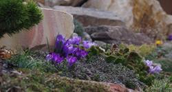
This is a random photo that I entered in the contest (and it didn't fare all that well compared to the rest of those in the category). Fire away.
Thumb of 2015-12-13/evermorelawnless/a1395a

This is what I think:
Interesting composition/crop (and aspect ratio, too).
The depth of focus is both distracting and interesting.
The colors look muted or hazy or dulled. This is likely an artifact of a novice trying to post-produce it.
The colors, as they are, seem to work well together.
The juxtaposition of the living things and the rocks is compelling. Something about the promise of Spring with the counterpoint of the staid yet colorful-in-their-own-right boulders.
I'd like to see what someone who knew what they were doing with photoshop could do to this one.
The focus is a little suspect...or the photographer didn't hold entirely still for the shot.
The light seems right for the subjects even though the photograph has a gray pall.
----

I'm not saying that's the only way to critique a photo. Or even a good way. But those are some of the things that came to mind when I was trying to see it through new eyes.

Your turn. What do YOU think?

Also, post a photo or two for us to look at and analyze if you'd like.
This is fun: The thread "Asa's former lawn...or (better) Dirt's current gardens" in Garden Photos forum

My bee site - I post a new, different bee photo every day:
http://bees.photo
Last edited by evermorelawnless Dec 12, 2015 10:31 PM Icon for preview
Image
Dec 12, 2015 11:52 PM CST
Name: Mary
Lake Stevens, WA (Zone 8a)
Near Seattle
Bookworm Garden Photography Region: Pacific Northwest Plays in the sandbox Seed Starter Plant and/or Seed Trader
Winter Sowing
Hi-
I recall this one-it was on my short list of about half a dozen top photos in that group, both because it was a nice photo, and I was attracted to the scene. I actually don't remember if it was one I voted for.
I am an amateur and I am trying to 'up my game' too, so here goes-

I agree interesting crop/composition
I agree depth of focus is both interesting and distracting.
I also like the colors.
I also agree about the juxtaposition thing
I don't know that I want to see much Photoshop here-when I think of a photo contest, I tend to think of a plain photo, some of the Photoshop stuff quickly ends up in the "Yes it is art (graphic arts)but not a photograph" category for me.
Focus good enough for this purpose, you can probably tell better than us. I did not vote for a few otherwise great photos in the contest because the focus was not great, and in a contest I do count that as important.
I agree the light is correct.
I think there is room for improvement in the need for some more light tones and dark tones, it is all sort of in the middle.
I think the striped rock competes with the crocus, so I get distracted without a single subject.
The green plant in the upper left is also a bit too much, maybe it is too bright or too big, but it also competes some.

I admire the photo, and your garden too!
Now I better find one of mine to put in here.
Image
Dec 13, 2015 12:36 AM CST
Name: Mary
Lake Stevens, WA (Zone 8a)
Near Seattle
Bookworm Garden Photography Region: Pacific Northwest Plays in the sandbox Seed Starter Plant and/or Seed Trader
Winter Sowing
OK here is one- it took a while, I discovered I take many more photos for documentation, than to try and get a great picture.

Thumb of 2015-12-13/Pistil/83f948

I did not get quite the effect I was trying for. Probably a composition thing, possibly I needed a bit of highlights with a reflector or flash? Maybe it's just the bright sky? I want to think about it and try again next spring when the fir cones are like this.
Image
Dec 13, 2015 9:06 AM CST
Moderator
Sweden
Forum moderator Garden Photography Irises Bulbs Lilies Bee Lover
Hellebores Deer Celebrating Gardening: 2015 Photo Contest Winner: 2016
A very good summation of important things to remember when giving or receiving critique Asa Smiling

Some technical data would perhaps also be good to provide: Camera, lens, focal length, flash, hand held, tripod, f-stop, shutter speed. In some cases this will make it easier to make suggestions. For instance maybe I want more depth of field in an image, but was that even possible for the photographer? Or if an image is a bit soft it can be good to pin down the issues to either shooting technique or perhaps only more sharpening would need to be applied on the final photo.

Regarding color and similar I'd like to remind everyone that one really needs to have calibrated monitor to judge this correctly and also either a color managed browser or download the image to a color managed program and view them there. However for copyright issues the last approach is questionable. Personally I'm in the process of moving everything to a new computer, so color issues comes painfully obvious to me today, so will not comment on color until I get this sorted out. Also it would be best to convert all images to sRGB color space before posting - but most will probably use this from the start anyway.

I'd also add that one of the scariest things may not be to actually post your image for critique, but it can also be intimidating for the one commenting! Especially if one is new to the area! So in particular I'd like to welcome all brave comment givers!!!! Commenting is very educational also for the one who comments, but it can also be very time consuming. Always keep this in mind and think about critique as a gift. People do this to help you, not the other way around!

Also I think it can be useful to indicate what level of critique you want. Not everyone will know your shooting style so if you are a beginner or an experienced photographer you may want/need different levels of critique.
Image
Dec 13, 2015 9:45 AM CST
Moderator
Sweden
Forum moderator Garden Photography Irises Bulbs Lilies Bee Lover
Hellebores Deer Celebrating Gardening: 2015 Photo Contest Winner: 2016
Asa, I recognize your photo from the contest and while it was one of my favorites Smiling I remember my thoughts viewing this was that the depth of field wasn't enough. It seems to me(please correct me if I'm wrong) that your goal was a wide representation of this beautiful scene, but still wanting some special attention on the crocuses. I like the idea here, but the selective focus is pulling my eyes also towards the in focus greenery on the right. This makes me as a viewer a bit confused about what the image is about: Crocus or greenery? I think that had more of the foreground crocuses been in focus, this could have been avoided.

Other than that, the brown leaf on the left could have been removed prior to shooting and perhaps also a tiny, tiny crop on the right to remove the purple out of focus flower on the right edge would work well for my tastes, as I like to simplify a scene as much as possible.

I like the intimacy the conifer on the left lends the scene, almost as it protects the crocuses and the light is also really good. Few suggestions aside, this basically is a very nice photo and it gets a Thumbs up from me.
Image
Dec 13, 2015 9:58 AM CST
Thread OP
Name: Asa
Wasatch Front - Utah
Bee Lover Garden Photography Region: Utah Photo Contest Winner: 2016 Photo Contest Winner 2019 Photo Contest Winner 2021
Garden Ideas: Master Level
Oh, I'm so thrilled by the quick participation so far. And the tone that the posts are taking. I appreciate the points that people are making on that photo, too. It's not one I'm particularly proud of, but it's interesting nonetheless and really has a lot of talk-about-able elements in it (which is the primary reason that I chose it).

Thoughts on the thread generally:
On this site, we have a brooooooooooooooooooooooooad spectrum of photographers and critique-ers. It runs the gamut from those who point and shoot with the phone to those who really talented enough and practiced enough to be shooting for National Geographic. And piles of folks in the middle.

In order to be incredibly inclusive of all on the spectrum here, I intentionally set the bar pretty low as far as barrier to entry and expectations of both photos and critiques. I want to see what EVERYONE has to offer - and want to hear from everyone on the photos, too - if only, "that one makes me feel <like this or that>".

William knows his stuff for sure. Dirt is getting a monitor-calibrating spider for Christmas as that's our next step. But...given the nature of this site, I don't want anyone to feel like that for the purposes of this thread that you need to me a sage or a magician or technician to participate. Post your phone photos. Post your masterpieces. Let's all practice critique-ing AND receiving (and implementing) critiques.

And let's take the stuff William and the other skilled people point out and implement the suggestions and ideas as we can in our path to making better art - as we can.

Guess what I'm really trying to mumble through here is that I hope the bar to participate in this thread is SO low - yet that the thread is open enough for the skilled to tune us up as they can. So don't be discouraged if some of the stuff is overtechnical - and don't hesitate to post next-level stuff here (whatever that level is for you). Like we say at our house, "incremental progress is a win."

Again, thanks for your comments on that photo. I appreciate them and keep them coming. I so want to reshoot that one...maybe in a couple of months!
Image
Dec 13, 2015 10:08 AM CST
Thread OP
Name: Asa
Wasatch Front - Utah
Bee Lover Garden Photography Region: Utah Photo Contest Winner: 2016 Photo Contest Winner 2019 Photo Contest Winner 2021
Garden Ideas: Master Level
@pistil

That's dirt's garden. She deserves all the credit for its beauty for sure. All I did was rip out a HUGE portion of my lawn and add 30 or so yards of amendments to the thing. She's the artist. I sometimes sweat. Sticking tongue out

To your photo:
That's one that I' would have been proud to call mine.
I realize that the copyright is important, but it's incredibly distracting to me. I know that it needs to be over the top of something important so the photo doesn't get stolen, but...
I think the lighting is *almost* perfect, but I cannot help but wonder if a little less might do the photo a favor.
OR...and I think this is the first change I'd make if I could reshoot it - if you gave it a little more depth - maybe one or two more stops - that would account for what seems to be some oddness of light on the right side of the right cone.
I think it's well-composed and well-cropped and pleases my "sense of shape"
Image
Dec 13, 2015 10:09 AM CST
Moderator
Sweden
Forum moderator Garden Photography Irises Bulbs Lilies Bee Lover
Hellebores Deer Celebrating Gardening: 2015 Photo Contest Winner: 2016
Mary, those cones are very fresh looking and makes me long for spring. Living in the forest I like the view very much, makes me feel right at home Smiling
I think you have some good thoughts about filling in those shadows a bit with a reflector and that is what I'd do myself.
Visually the cones perhaps would stand out better had you not included the sky in the shot, its brightness draws attention from the cones and also because the sky creates a dividing line directly through the subject which can be hard to pull off.
As for suggestion, come spring you could perhaps play around a bit to see if you could invent a shooting angle to keep both the branches and the cones in focus?

Many thanks for sharing Smiling
Image
Dec 13, 2015 11:07 AM CST
Name: Mary
Lake Stevens, WA (Zone 8a)
Near Seattle
Bookworm Garden Photography Region: Pacific Northwest Plays in the sandbox Seed Starter Plant and/or Seed Trader
Winter Sowing
Thanks, this is helpful.
The copyright thingy is an automatic-did I make my settings here to show it? Do I have a choice of where it goes? (I agree with you).
I think in spring I will play around with this tree if it makes nice cones again.
The shot was at 5 pm in April, so nice light, very windy day. 1/800sec f3.2 ISO 200 105mm Macro lens.
To eliminate the sky, I could put a piece of cardboard or something there (the lower dark is a fence across the yard).
To increase the depth of field a little, I could change the aperture a little, and would still be able to stop the action (it was a very windy day).
It is interesting, I sometimes use the camera on the automatic setting, but for garden and flower photos they are overexposed, often by 2 stops.
I might darken the photo a bit by using a smaller aperture by even one notch, and then use a reflector to fill in (I bought reflectors this summer, have not started playing with them yet, still mostly taking 'snapshots'.
ps this is a jpg file at 13.2 MB, it took forever to load, and sometimes the website 'chokes' on ones that big. What is a useful median file size for this webside? I assume the ones that won't get big here if I click on them are ones in the 1-2MB range? Is there a thread about this topic somewhere?
Image
Dec 13, 2015 12:36 PM CST
Moderator
Sweden
Forum moderator Garden Photography Irises Bulbs Lilies Bee Lover
Hellebores Deer Celebrating Gardening: 2015 Photo Contest Winner: 2016
Mary, I think the maximum allowed width of an image here is 1000 pixels so you can safely resize your images to that size with your favorite software and that will speed your upload a lot Smiling .

I'd never have guessed that the background was a fence. I was rather convinced it was out of focus trees Hilarious! . A piece of cardboard would work well, provided there is no shadow cast on it. Some like to take an out of focus background, print it on matte paper and use that as a makeshift studio background, but never tried that myself.

Sorry to hear about your metering problems. It is often more difficult to meter for macros, but two stops still sounds like a lot.
Some thoughts:

Try a different metering method, sometimes one works better than the other.
Is the problem the same, regardless of which lens that is used?
If you can't get to the bottom of this, but the problem is consistent, you could simply dial in exposure compensation in these circumstances. I got the impression that you were using fully manual and you shouldn't need to do that (unless you want to of course).
Image
Dec 13, 2015 12:37 PM CST
Name: Dirt
(Zone 5b)
Region: Utah Bee Lover Garden Photography Photo Contest Winner: 2014 Photo Contest Winner: 2015 Photo Contest Winner: 2016
Photo Contest Winner 2018 Photo Contest Winner 2019 Photo Contest Winner 2020 Photo Contest Winner 2021 Photo Contest Winner 2022 Photo Contest Winner 2023
Cool Green Grin!
digging trench>>>putting bar in trench
reflector? some kinda shiny thing that reflects light in some directed fashion? hmm......interesting...

Mary, I really like the cones and in this moment I am struggling to understand how a reflector would alter this image because I am so ignorant about imagining that--
I don't mind the shadows in this shot per se, but I agree that if the angle were slightly different it could make a big difference with both the bright skyline cutting through the subject and the plane of focus.

Max image size is 1000 pixels wide once uploaded to the site, so anything smaller than that won't get bigger if you click on it.
The copyright thingy is in your profile settings; I don't know much about how you can direct where it goes but I think there is a way.
Image
Dec 13, 2015 1:16 PM CST
Moderator
Sweden
Forum moderator Garden Photography Irises Bulbs Lilies Bee Lover
Hellebores Deer Celebrating Gardening: 2015 Photo Contest Winner: 2016
Dirt, a reflector doesn't need to be shiny. Something as simple as a white piece of paper is all that is needed. If placed below the subject it would remove some of the dark shadows, giving more details in the darks, essentially giving the impression of softer light. The risk of course is that if too much light is reflected one would end up with a very flat uninteresting light instead, making things worse, instead of better. This can happen real easy... Here I think only very little reflected light would be needed as the light is already pretty good Smiling .
Image
Dec 13, 2015 1:47 PM CST
Name: Ann ~Heat zn 9, Sunset
North Fl. (Zone 8b)
Garden Sages Region: Ukraine Native Plants and Wildflowers Xeriscape Organic Gardener I was one of the first 300 contributors to the plant database!
Garden Ideas: Master Level Butterflies Charter ATP Member Plant Identifier Million Pollinator Garden Challenge Dog Lover
All righty then. I'm brave. I'll jump in.

Thank you Asa for making it clear this thread is for everyone.

I am just about as newbie as one can get so my critiques, really observations, are based on my personal viewpoint - a beauty is in the eye of the beholder type thing. Please take them as such.

Asa,
The blur in the lower left to mid foreground distracts me. In direct opposition to Mary, the stripes in the rock please & intrigue me and to me, compliment the crocus.
My gut keeps saying that I want to see more of the picture. I keep wanting to see what is further to the right even if it's not in focus.

Mary,
The tips of the 2 featured cones not being sharply clear bother me. That out of focus new growth on the lower left keeps drawing my eye away from everything else the photo is about. I find myself wanting to push it away with my hand.
I am a strong believer in the simple fact is that what matters in this life is how we treat others. I think that's what living is all about. Not what I've done in my life but how I've treated others. ~~ Sharon Brown
Last edited by flaflwrgrl Dec 13, 2015 1:55 PM Icon for preview
Image
Dec 13, 2015 1:54 PM CST
Name: Ann ~Heat zn 9, Sunset
North Fl. (Zone 8b)
Garden Sages Region: Ukraine Native Plants and Wildflowers Xeriscape Organic Gardener I was one of the first 300 contributors to the plant database!
Garden Ideas: Master Level Butterflies Charter ATP Member Plant Identifier Million Pollinator Garden Challenge Dog Lover
This is the camera:
http://www.fujifilmusa.com/pro...

Until this camera, I have never held anything but a pocket point & shoot. This is about the 7th time I have taken any photos with this camera. This was taken on the auto setting, through a double paned window. I have no clue what I'm doing but I want to. Don't worry about my skin -- at this point I'm such a newbie I have no skin. I have done zero editing to this photo.

Thumb of 2015-12-13/flaflwrgrl/695757

My thoughts:
I feel the subject should be clearer? sharper?

Other than that I really don't know. You tell me please.
I am a strong believer in the simple fact is that what matters in this life is how we treat others. I think that's what living is all about. Not what I've done in my life but how I've treated others. ~~ Sharon Brown
Last edited by flaflwrgrl Dec 13, 2015 1:56 PM Icon for preview
Image
Dec 13, 2015 2:18 PM CST
Moderator
Sweden
Forum moderator Garden Photography Irises Bulbs Lilies Bee Lover
Hellebores Deer Celebrating Gardening: 2015 Photo Contest Winner: 2016
Ann, you gave some good and well thought out critique there Hurray! .

I'd imagine having having no skin would make everything feel more painful, but I could be wrong about that Hilarious! I do like my own skin very much and wouldn't want to be without it Sticking tongue out

I think shooting through a window has reduced the image sharpness a bit so that could be what you are seeing.

I really like that you have plenty of space in front of the bird. My only suggestion would be for a lower shooting angel. You will create more intimate images that way as you will make the viewer feel more connected to the subject. Ideally if the bird is on the ground, then you should be on the ground. Otherwise a nice image!!!
Image
Dec 13, 2015 2:25 PM CST
Moderator
Sweden
Forum moderator Garden Photography Irises Bulbs Lilies Bee Lover
Hellebores Deer Celebrating Gardening: 2015 Photo Contest Winner: 2016
I was looking through my archives to find something that I have some mixed feelings about and therefore never shared with anyone.

Thumb of 2015-12-13/William/35698d
Fargesia murieliae

It was shot with a Nikon D300, 300 f2.8 Vr+1,7tc, f/7.1, 1/30, iso 280, tripod, Full frame (no crop)

I worry about the depth of field here, what are your thoughts? I think at the time I was prioritizing the smoothness of the background, but today I'm uncertain about this choice.
This is from April 1st 2009 so after the winter the foliage of this bamboo isn't as pristine as it could be. I feel that this detracts a bit from the image, on the other hand for every year that passes, for some reason I feel more at home with decay and dead leafs Whistling .
I of course welcome all comments and suggestions! Please, feel free to be as though as you like.
Image
Dec 13, 2015 2:48 PM CST
Name: Ann ~Heat zn 9, Sunset
North Fl. (Zone 8b)
Garden Sages Region: Ukraine Native Plants and Wildflowers Xeriscape Organic Gardener I was one of the first 300 contributors to the plant database!
Garden Ideas: Master Level Butterflies Charter ATP Member Plant Identifier Million Pollinator Garden Challenge Dog Lover
I like the artsy-ness of it. I like that the leaves are imperfect. What in nature is perfect? Perhaps looking at a landscape in real life would make you think it's perfect but upon examination you would find individual imperfections everywhere. If it were perfect, it would hold no interest for me. It would be like looking at a fake.

I think the background might have been a different color than the one chosen.
I am a strong believer in the simple fact is that what matters in this life is how we treat others. I think that's what living is all about. Not what I've done in my life but how I've treated others. ~~ Sharon Brown
Image
Dec 13, 2015 2:53 PM CST
Name: Catmint/Robin
PNW WA half hour south of Olym (Zone 8a)
Region: Pacific Northwest Region: Mid-Atlantic Region: Maryland Butterflies Bee Lover Native Plants and Wildflowers
Echinacea Azaleas Forum moderator Cottage Gardener Garden Ideas: Master Level Celebrating Gardening: 2015
I like that you can see what looks like the shadow of one leaf on the other.

I like the brown tip--to me it makes it look more real.

I'm not a photography expert by any means, but I found myself wondering about the extra gray background at the top, instead of cropping so the leaf fills the frame.
"One of the pleasures of being a gardener comes from the enjoyment you get looking at other people's yards”
― Thalassa Cruso
Image
Dec 13, 2015 3:42 PM CST
Name: Dirt
(Zone 5b)
Region: Utah Bee Lover Garden Photography Photo Contest Winner: 2014 Photo Contest Winner: 2015 Photo Contest Winner: 2016
Photo Contest Winner 2018 Photo Contest Winner 2019 Photo Contest Winner 2020 Photo Contest Winner 2021 Photo Contest Winner 2022 Photo Contest Winner 2023
I do like smooth backgrounds and you did a fine job there!
The less-than pristine thing is not a detractor for me in this image! It is an enhancer Smiling
I think it would be a very strong piece if the tip of the leaf, being so beautifully lit and curved/twisted and with its range of color, were also in better focus and the full frame were shifted just a little bit lower. The top shine and light line on the back leaf are great and important and yet the more interesting part of the photo to me is the lower portion of the flared triangle.

Background color--I just assumed that is just is what it is cuz that's what mine always are. But Ann's suggestion to choose a different color has me wondering about fake backgrounds...maybe I need to get some Hilarious!
Last edited by dirtdorphins Dec 13, 2015 4:50 PM Icon for preview

Only the members of the Members group may reply to this thread.
Member Login:

( No account? Join now! )

Today's site banner is by Newyorkrita and is called "Siberian Iris China Spring "

This site is protected by reCAPTCHA and the Google Privacy Policy and Terms of Service apply.