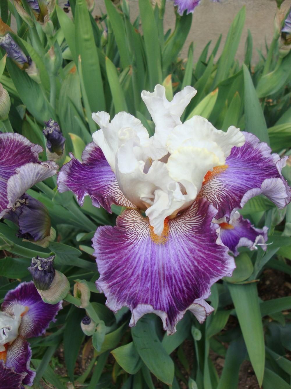
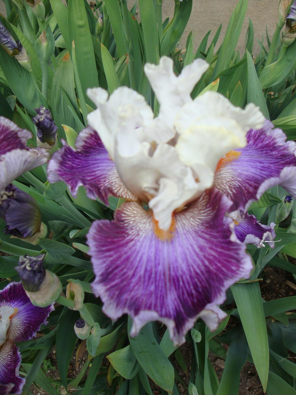
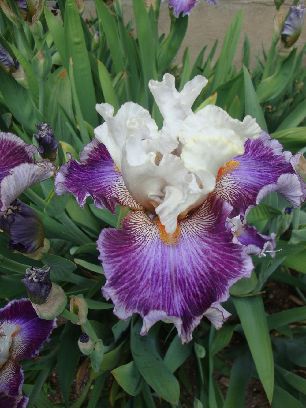
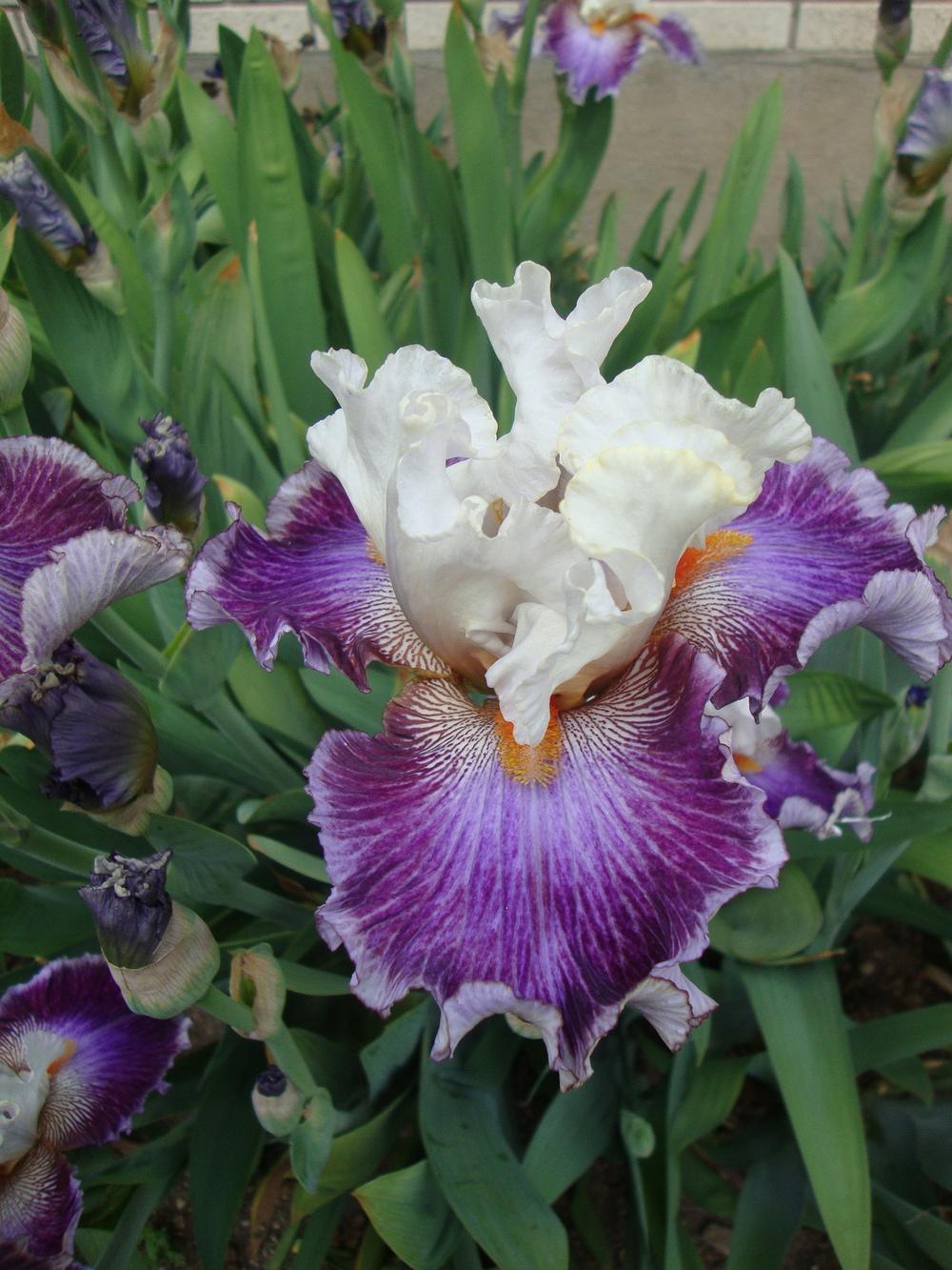
My pick is picture #7. The standards are very clear, and the overall of the photo is not as dark as #5 -- I thought that it showed off the color tones in the falls the best. Also, I liked the contrast between the white standards and the darker green leaves above it. I wish I could see the pictures side-by-side -- by the time I enlarged each, then clicked off of it and enlarged the next, I'd forget details of the previous. :confused:
I think #6 is nice too.
But like Polly said, each of our monitors is going to show things a little bit differently. So what looks good on mine might not look as good on someone else's. Any one of those pictures are just great Paul (except #4 -- looks blurry on my screen, enlarged) -- so you'd be good to go on any of those settings. It's fun to experiment a little, isn't it?

You have a really nice camera!!
Tom -- LOL!!!

(bring me back a rhizome -- shhhhh)


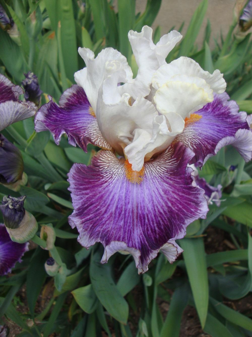
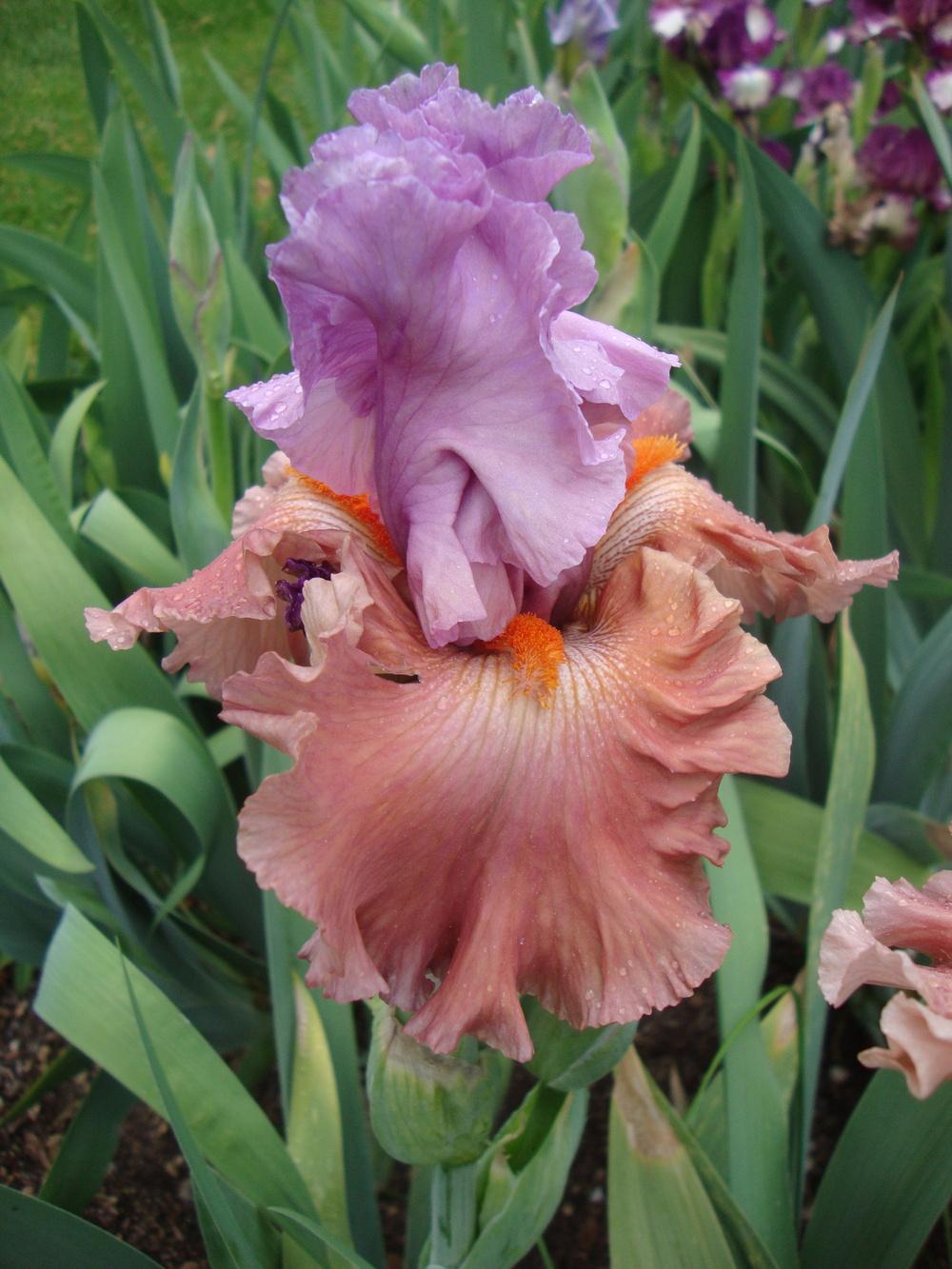 Adoree
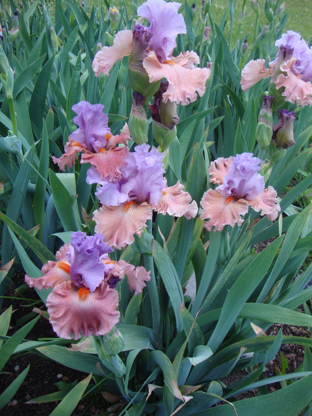 Adoree
 Brouhaha
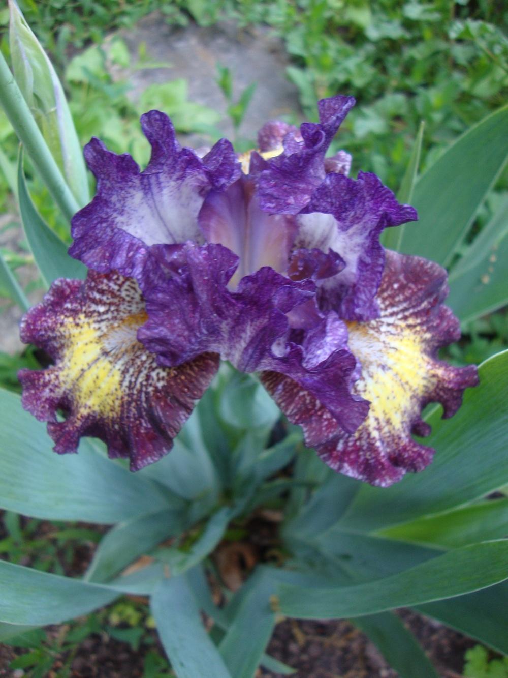 Tomfoolery
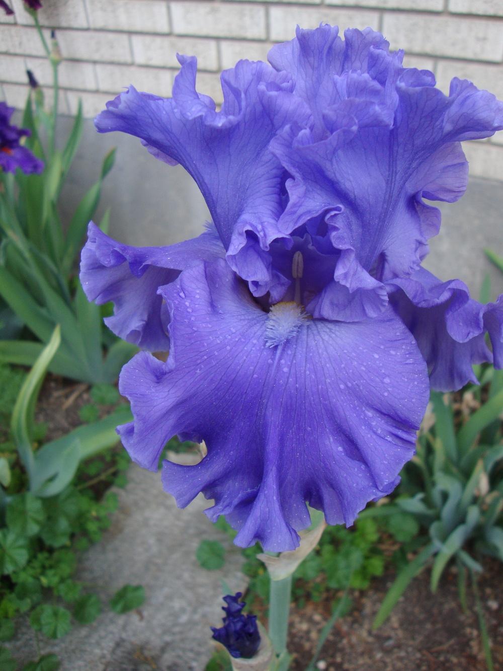 Seapower
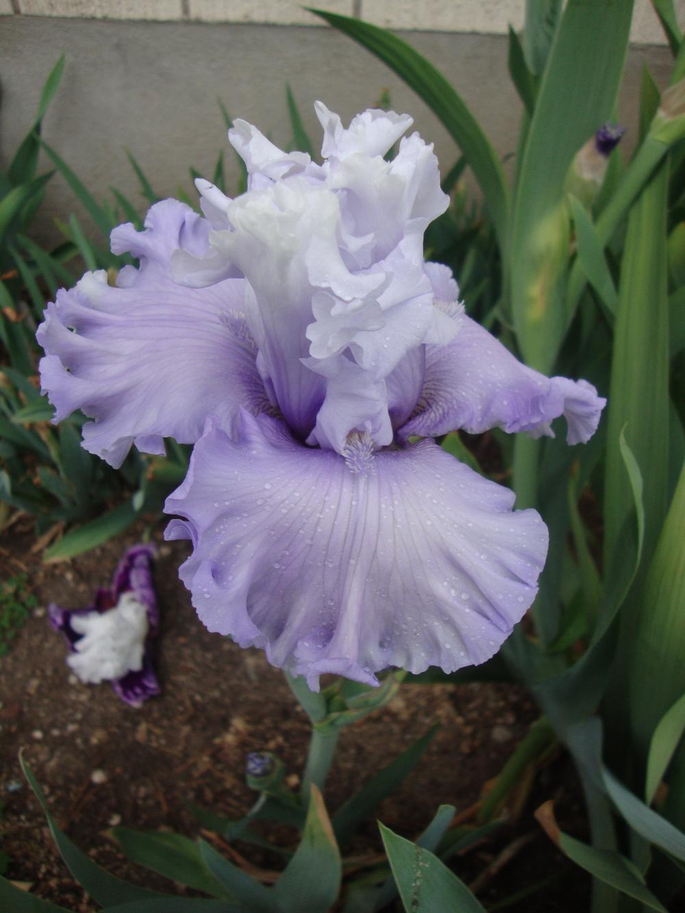 Through the Clouds
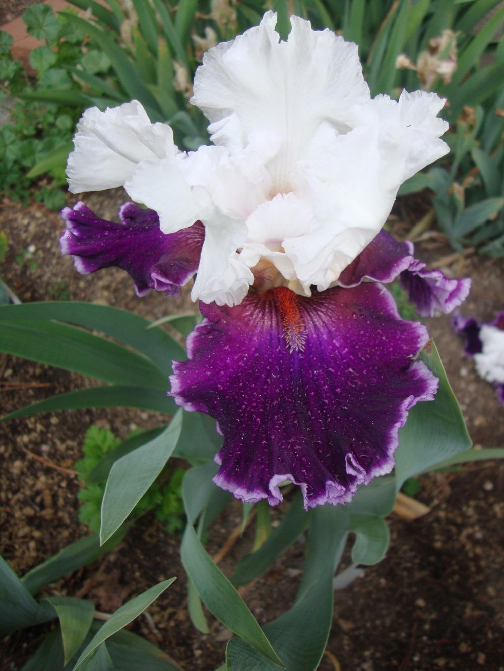 Applause Line
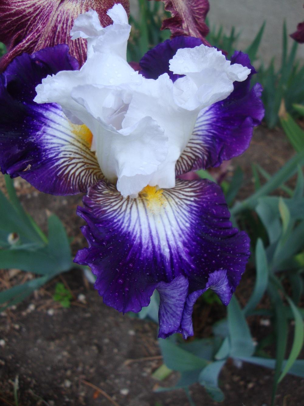 Dancing Queen
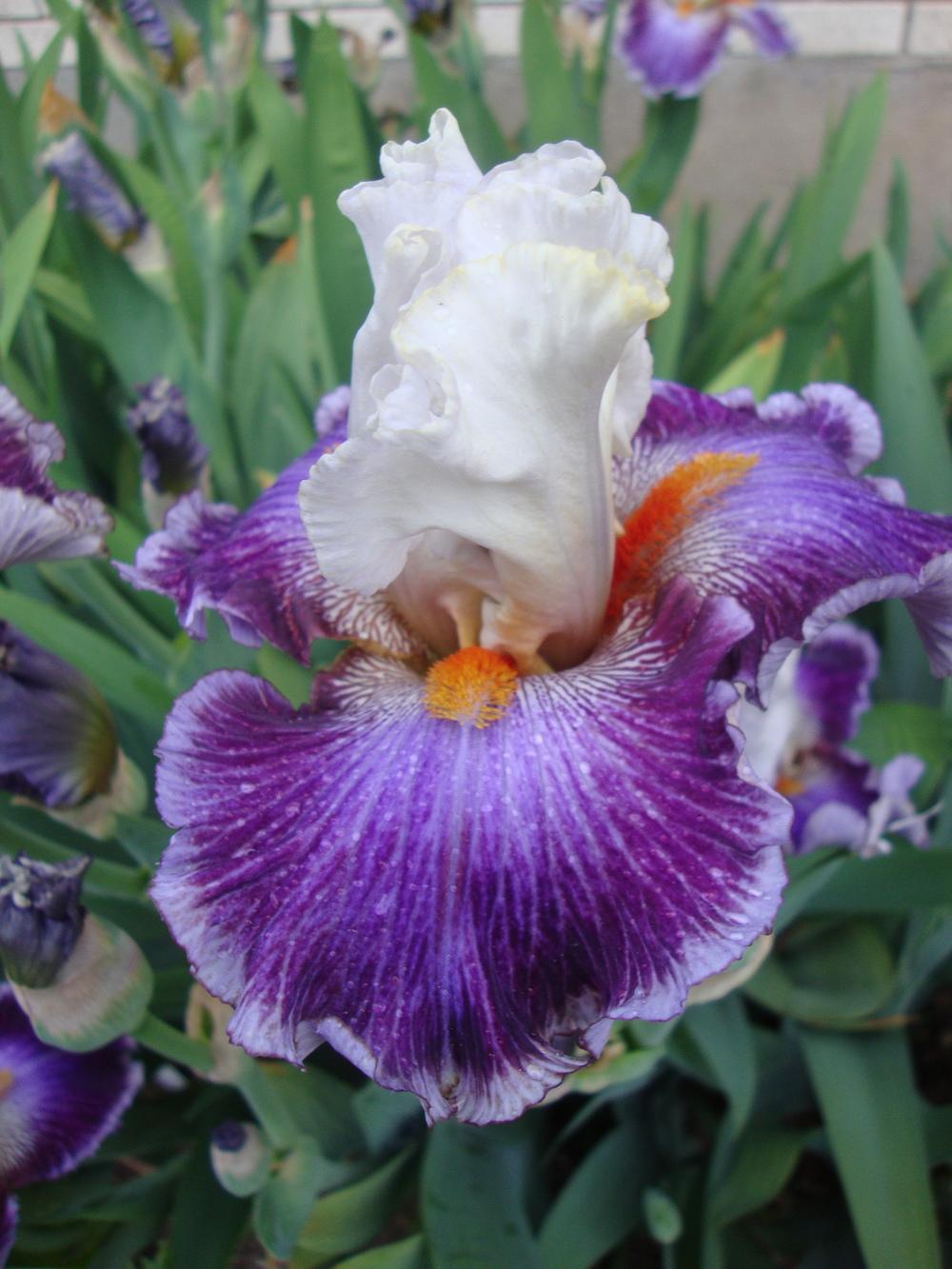 Seedling
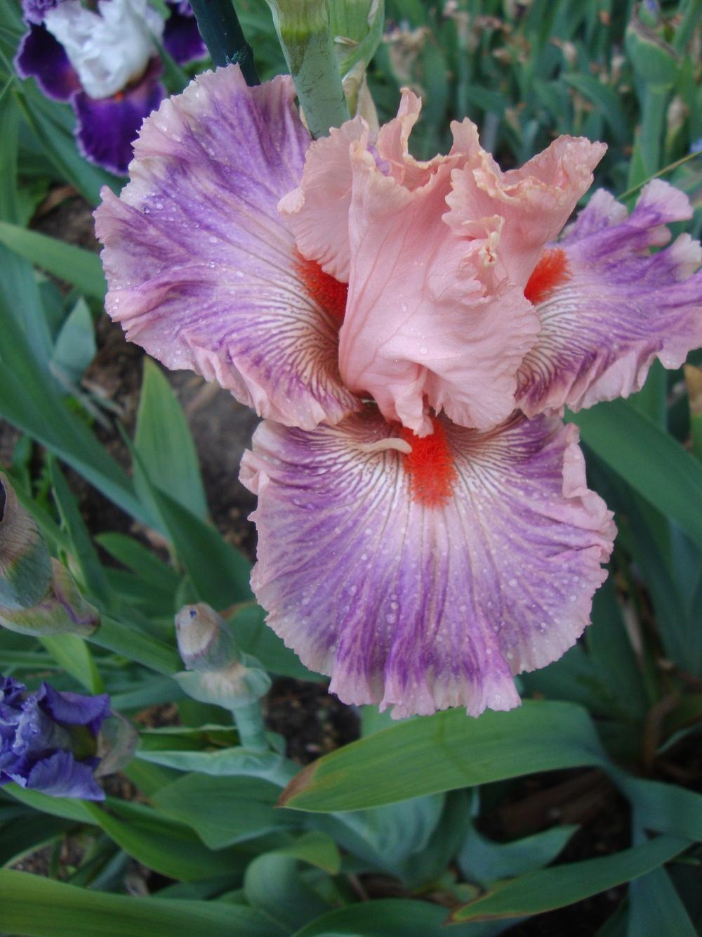 Seedling
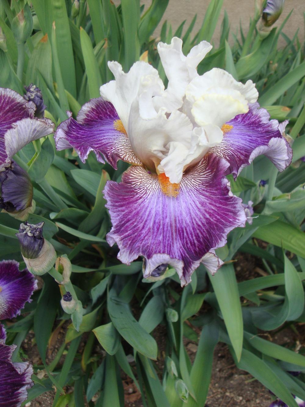
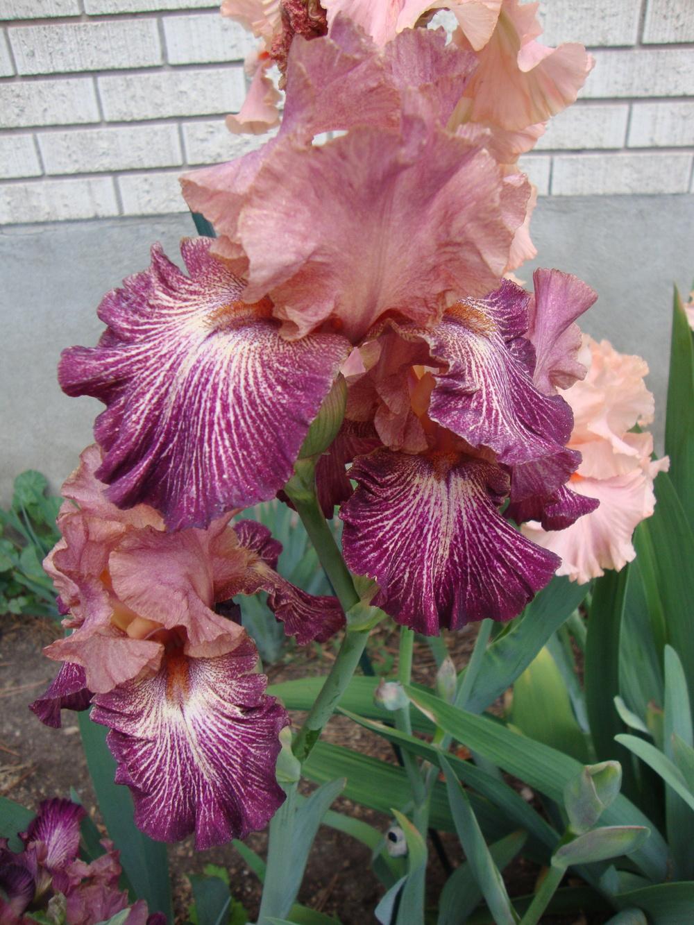 Artistic Web
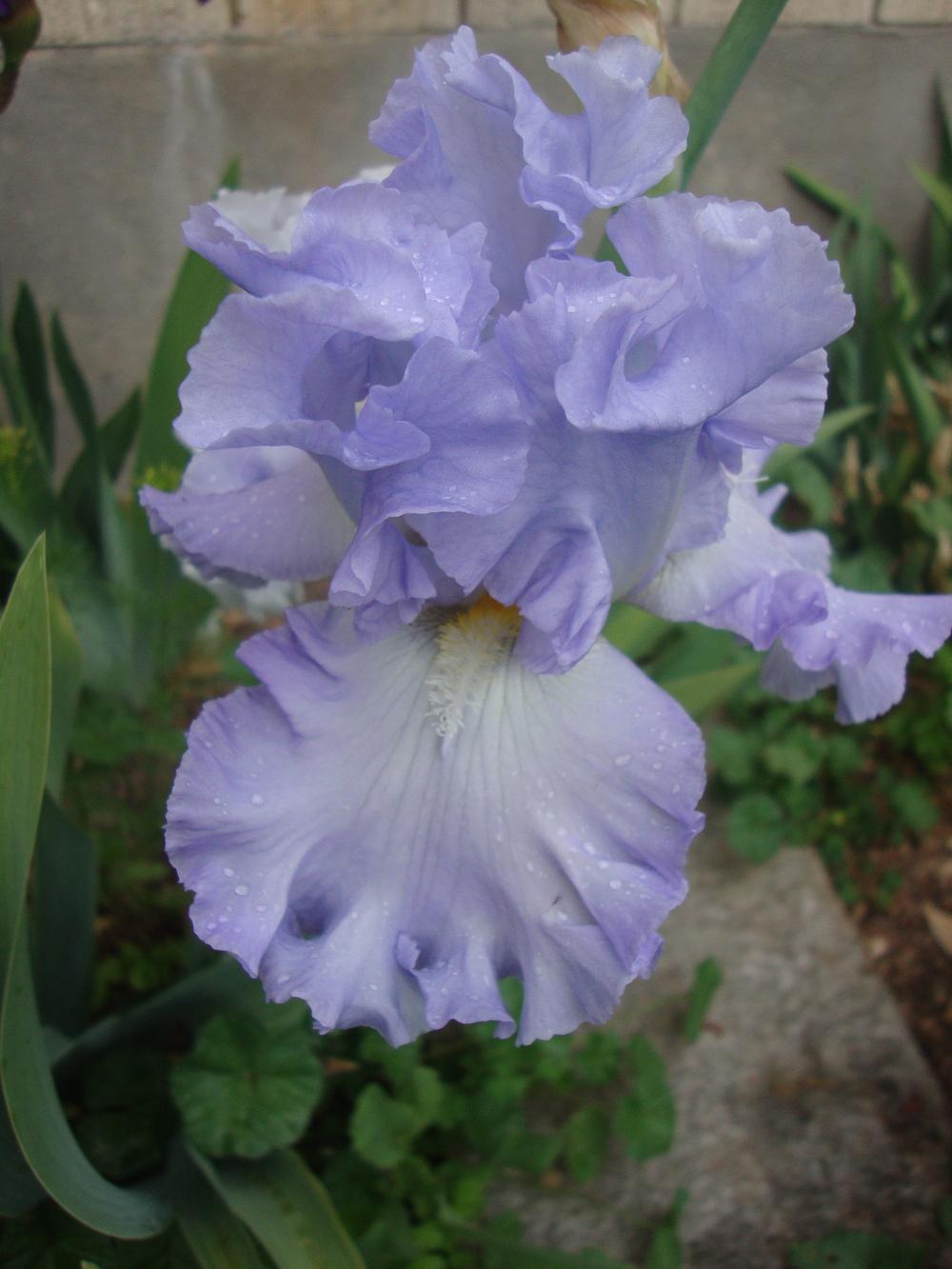 Absolute Treasure
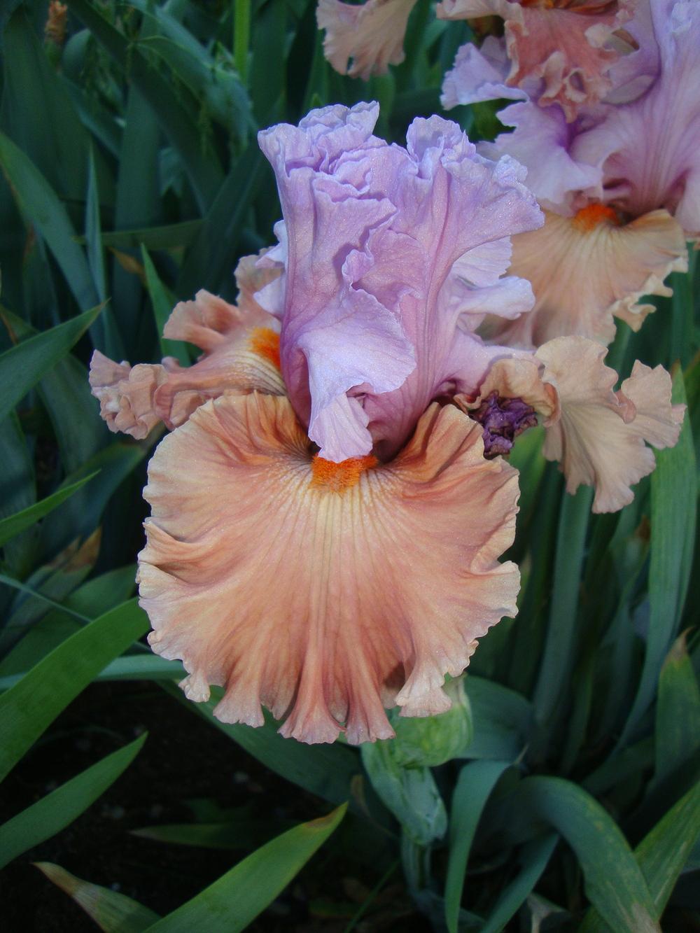
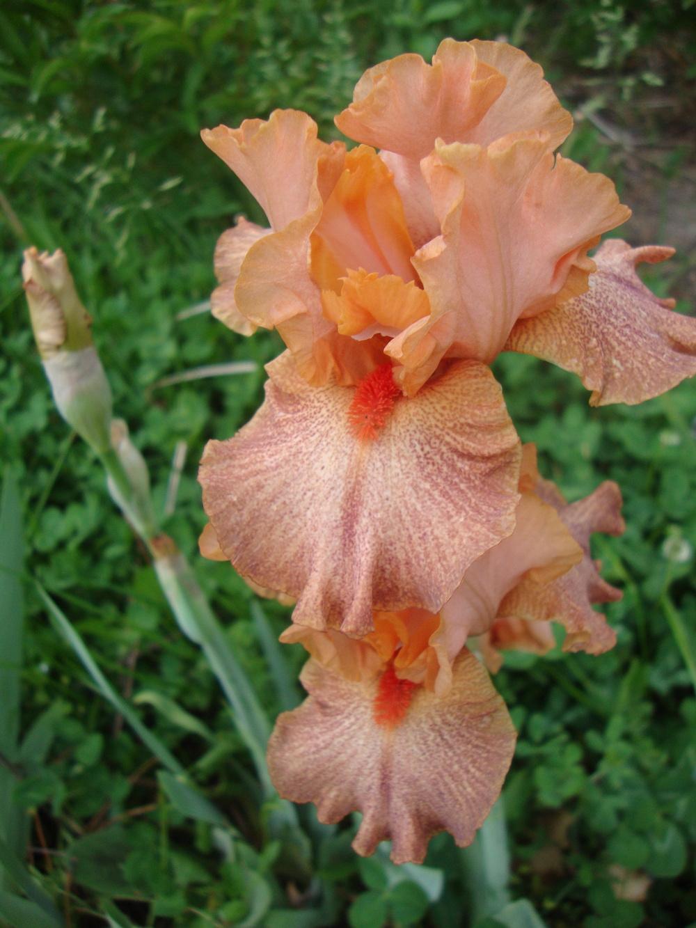 Spiced Peaches
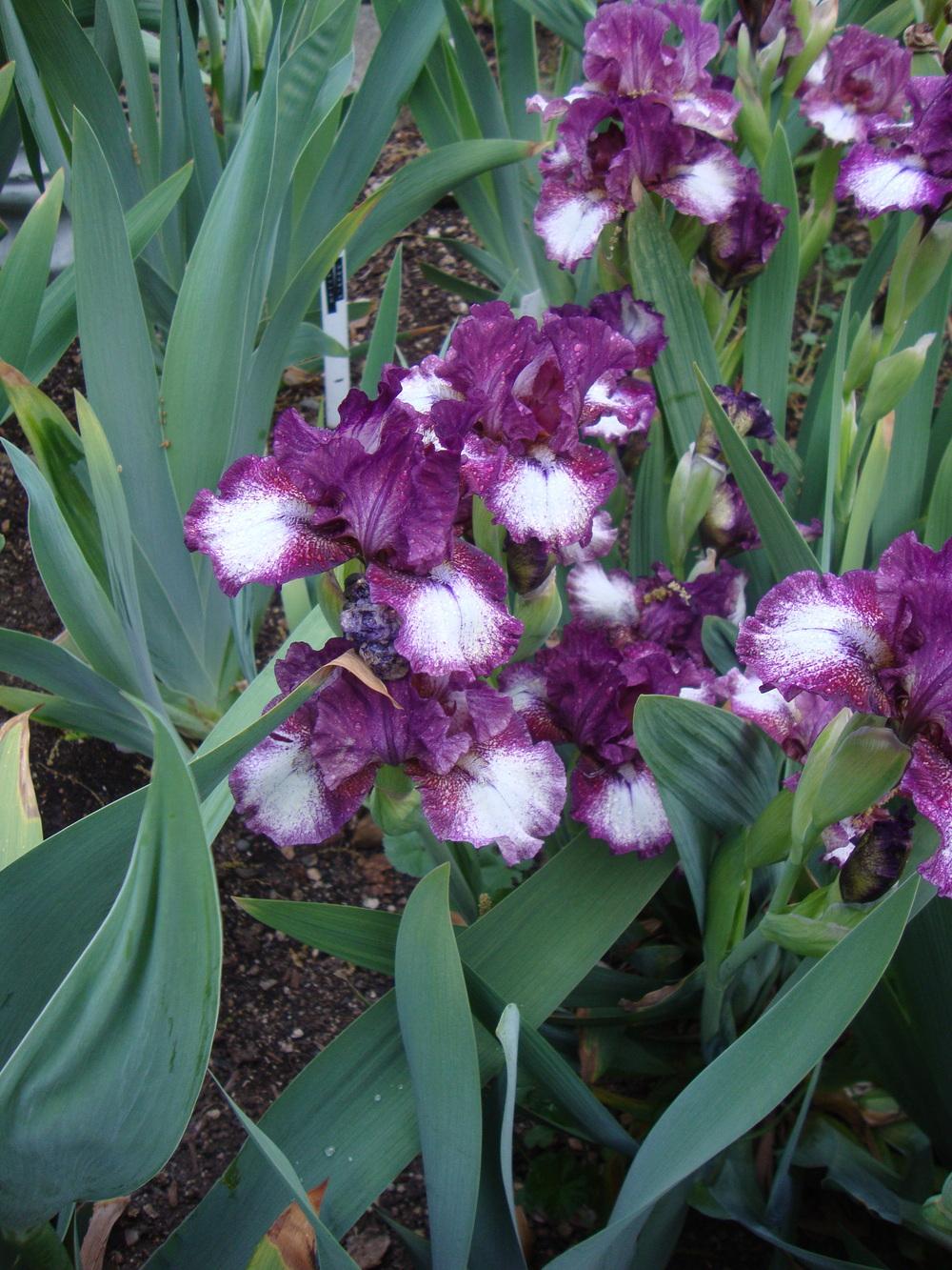 Spectator
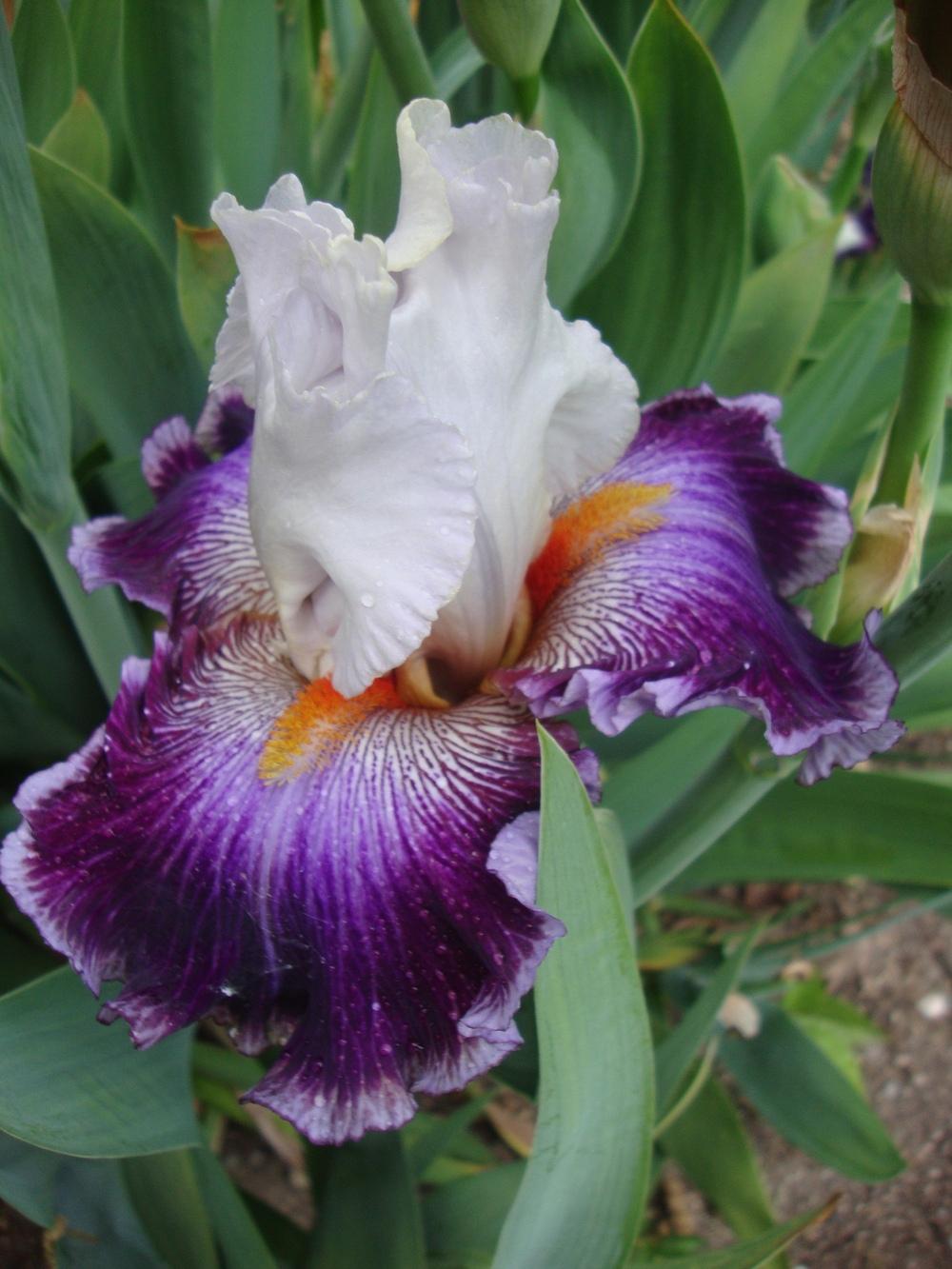 Seedling


 Merry Madrigal,,,,,,,two mediocre pictures
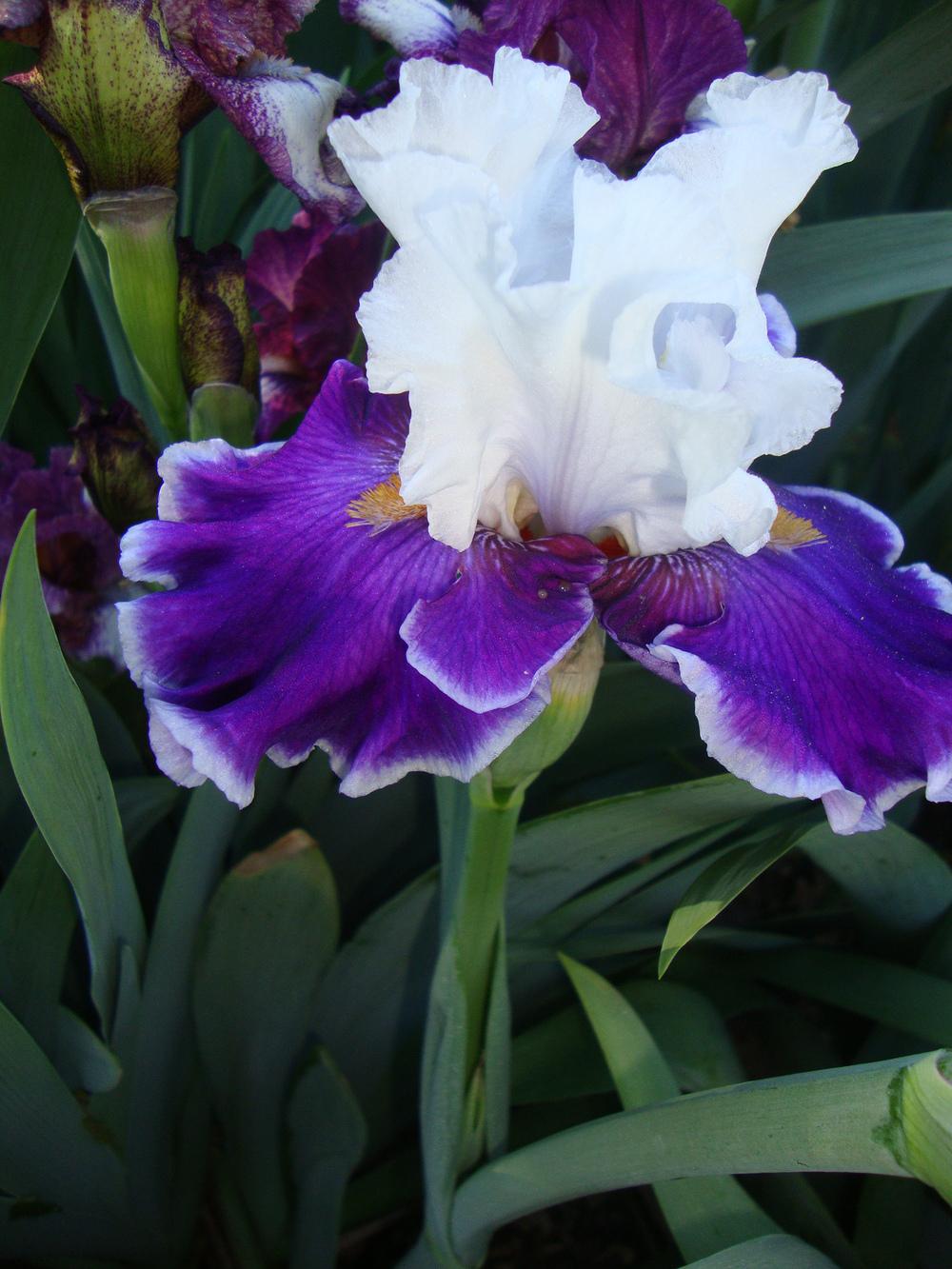
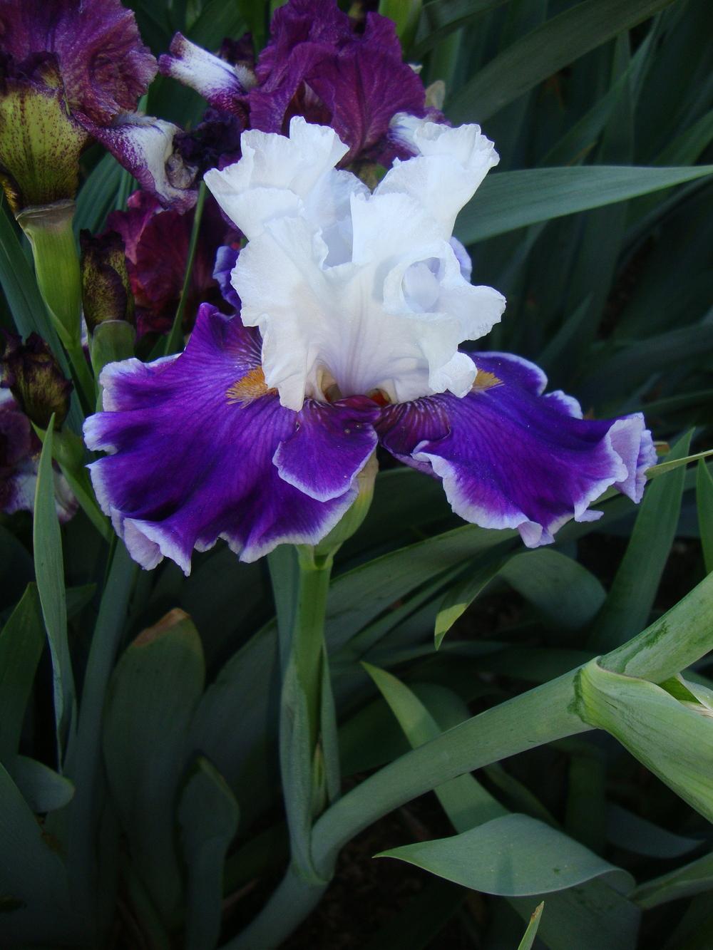
 Adoree
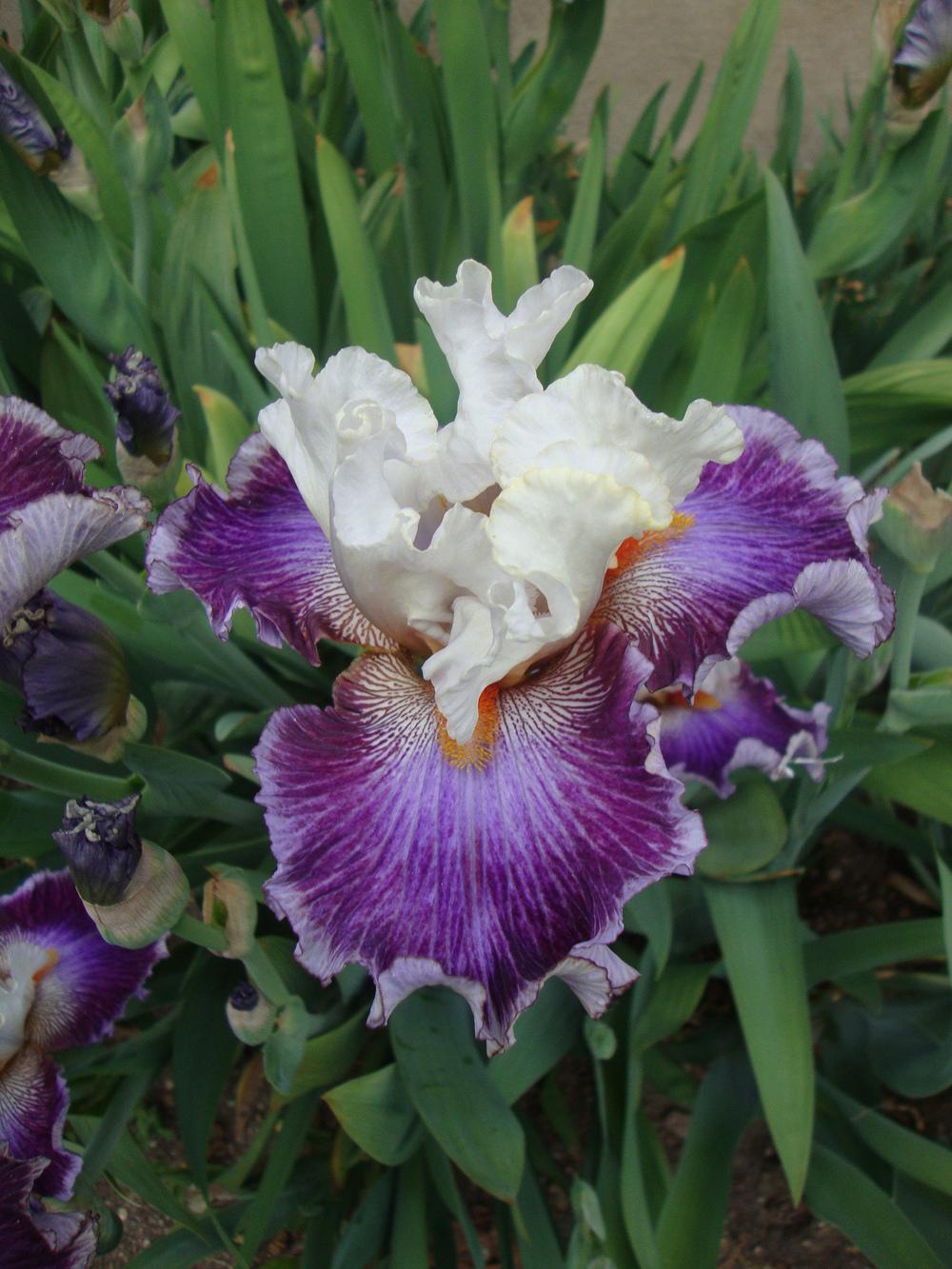
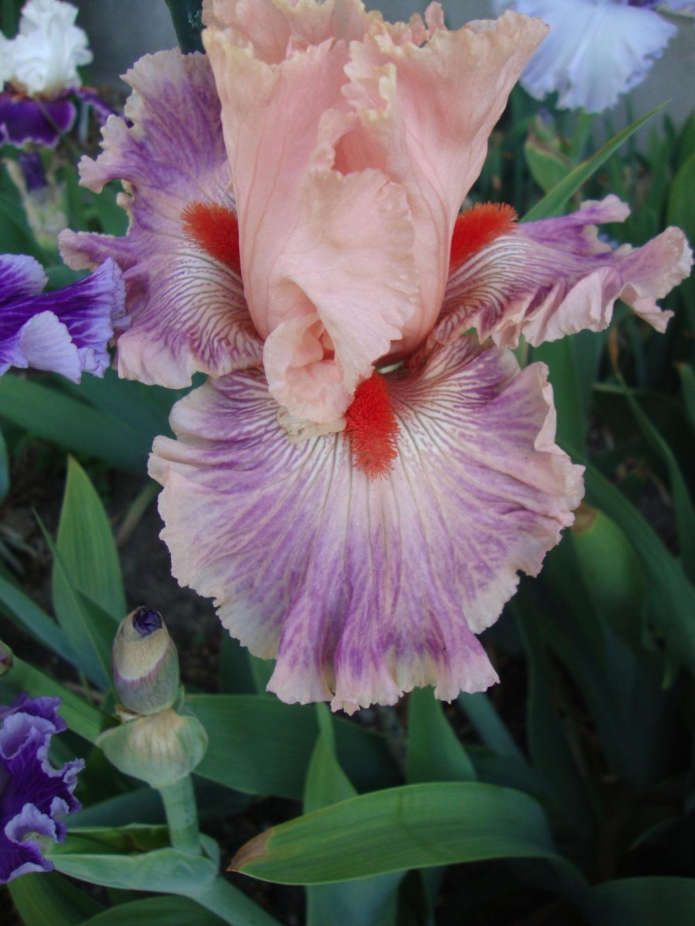 Seedling
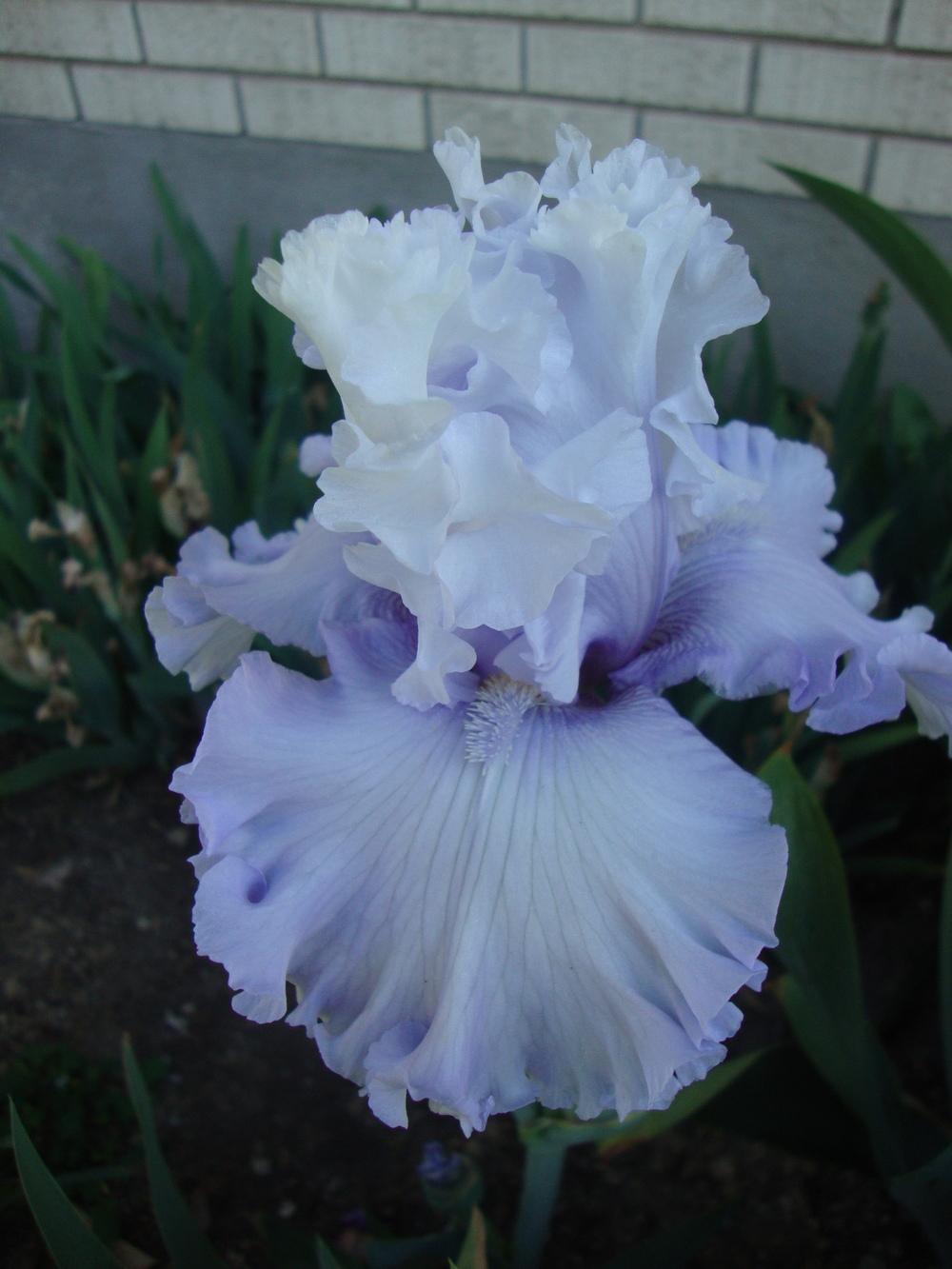 Above the Clouds
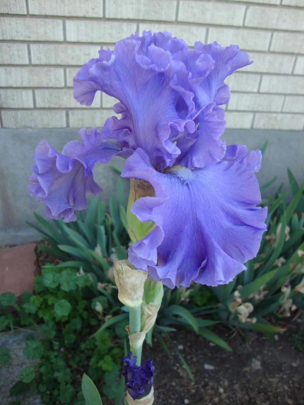 Sea Power
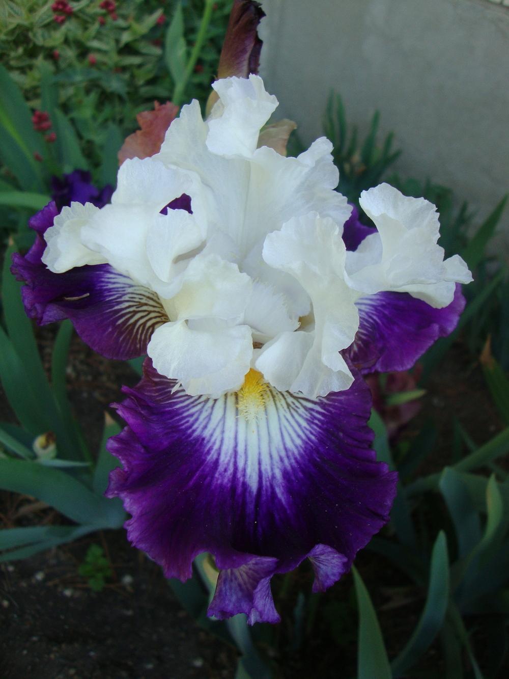 Dancing Queen
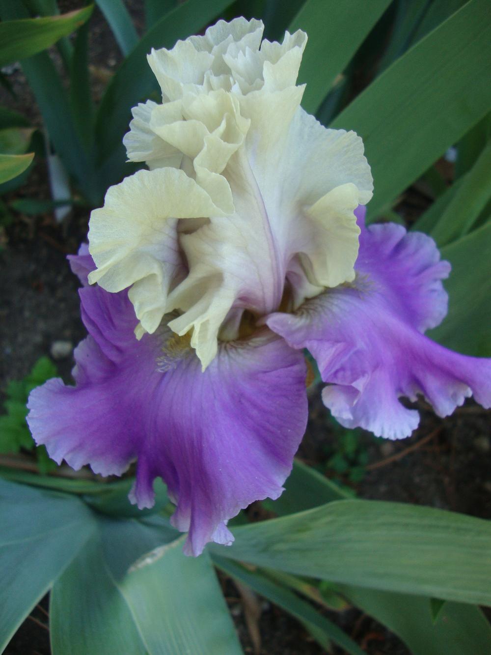 Subtle Beauty
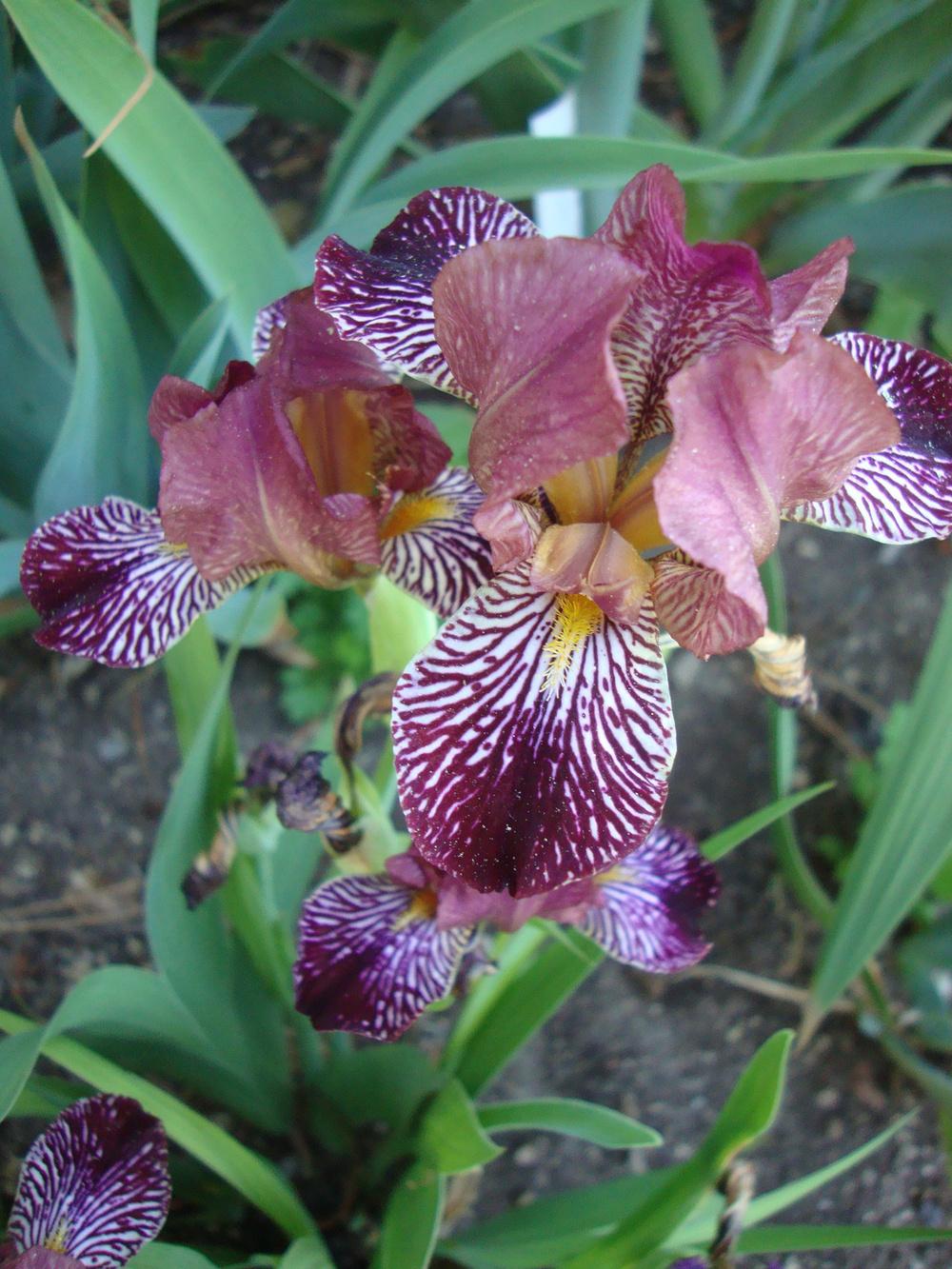 Reyes Adentro
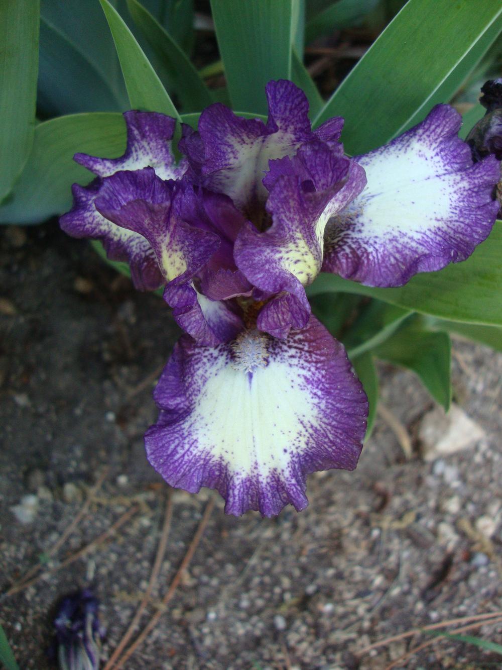 Dark Design
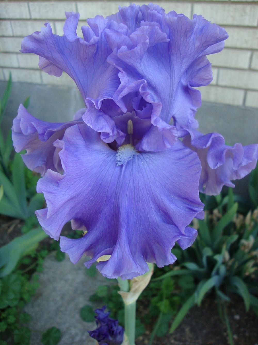 Sea Power
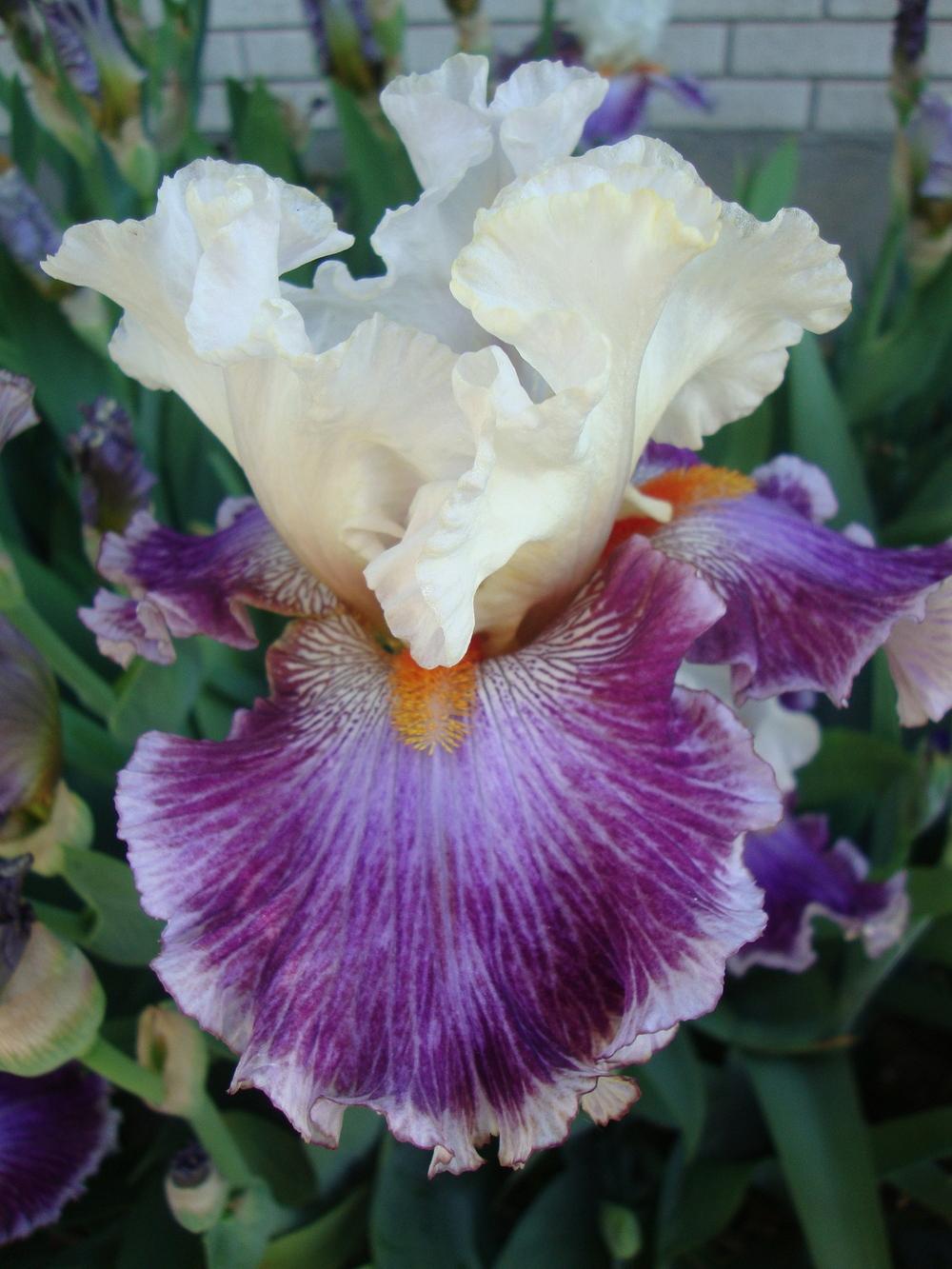 Seedling


